Experimental Mobile Camera: Joyners App for David Hockney Retrospective at LACMA

INTRODUCTION
Joyners is a spelling change from “Joiners”, which was used by David Hockney as a product-brand choice in order to demonstrate how fun using this tool is. This was an academic two-week sprint project that I attempted to work with in typical consultancy client format. An exhibition of David’s work was approaching, and I worked with a colleague in curatorial practice in order to serve as the client. My approach was to design an interactive artifact to be deployed in conjunction with the show. The core concept here was to leverage the components native in a mobile device, and develop software functions specific to a style and certain works, which would allow a user to mimic Hockney’s process of capturing and assembling images. In addition to this function, it was also a navigation tool to explore and engage patrons of the museum with the current work on display and Hockney’s greater catalog.
This project was done in the interaction design dept. of CCA
Under the guidance and instruction of Christina Wodtke
WHAT WE DID
• Generative Design Research
• Competitive Analysis
• Information Architecture
• UI Design, Visual Design
• Mobile Prototype
DESIGN BRIEF
Imagine the user interface, brand, and methods of interaction for an application based on a work of art that inspires you. Deliver a concept model, competitive analysis, and working prototype.
Mobile Prototype
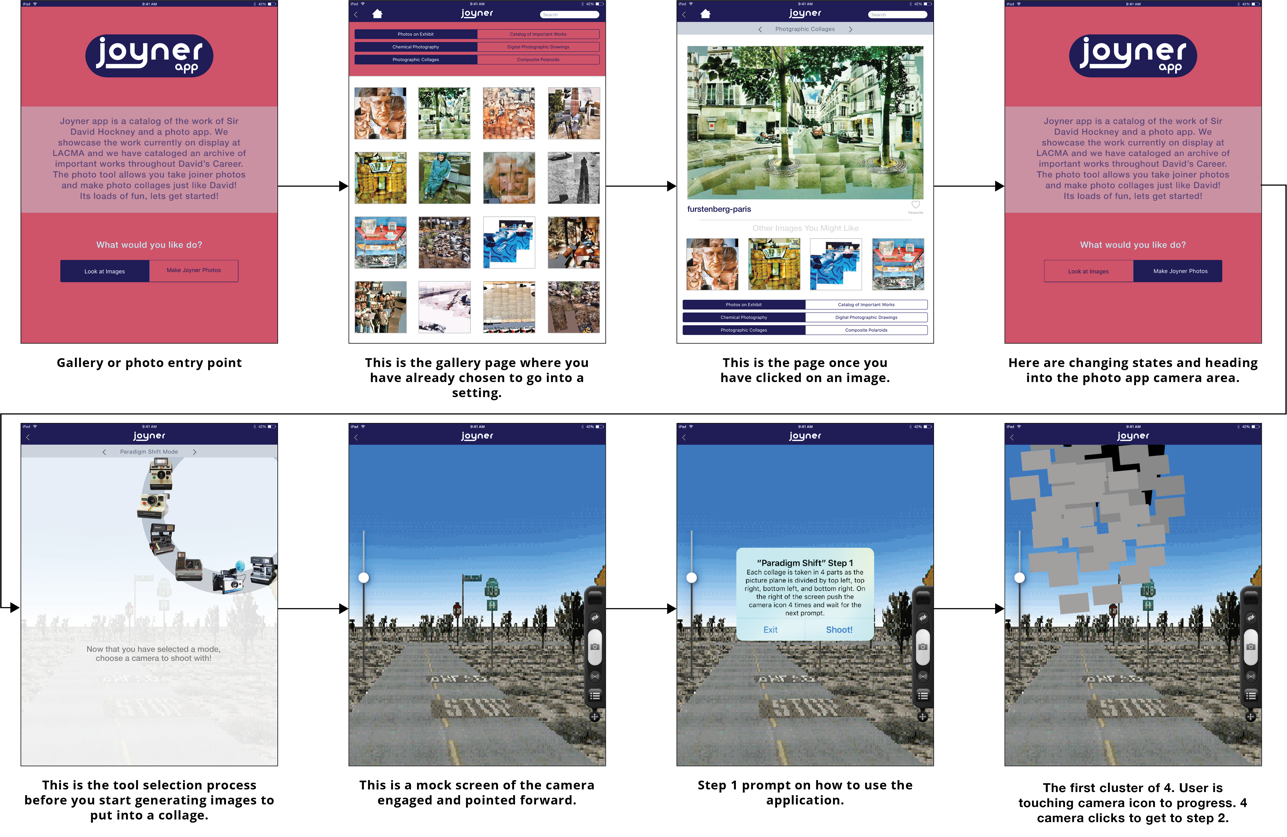
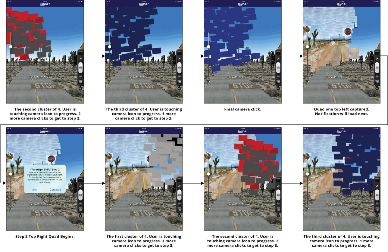
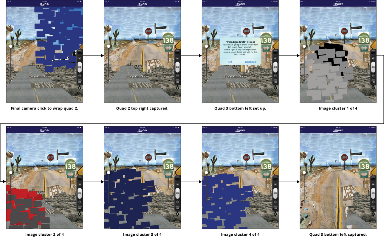
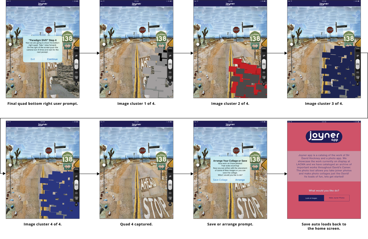
This prototype is aimed at onboarding a new user of the Joyner application into taking Joyner photos. The simulation begins at “Welcome” and steps through the collage state of reorganizing captured images, into a final assembly or saving the image. Its purpose was to interface with engineers about how to engage the hardware, as well as to develop around these function concepts we aimed to build.
Click To Explore Prototype
Explicit Vision: Master Pieces Into Functions
This particular image has influenced my work throughout my entire career. Capturing life and dissecting images through assemblage of this type, produce obviously spectacular results. The Joyners application is a tool that does two very specific things. First, it allows you to review the joiner photos and new photographic drawings that are currently on display in the LACMA “Hockney an Experimental Hero” photographic art retrospective currently hanging in the main gallery. It also has a gallery of notable works from Hockney’s catalog over the years. Second, and most importantly, it allows “the user” to take photos in the style of David. We have imagined the application to take on a number of protocols that capture a static landscape and subdivide it into a number of photos to assemble into a collage. Additionally, the app allows a user to switch modes from capturing a fixed landscape to move in space around a subject, and capture the subject from numerous angles, whereby the user is then able to assemble those images into compositions similar to those of Hockney.
Pearblossom Hwy., #2
Chromogenic print
April 11-18, 1986
© 1986 David Hockney
Archetype Screens: Shooting Joyners & Exploring The Catalog

Select Camera
This is the tool selection process before you
start generating images to put into a collage.

Arrange Collage
This is the state after you have auto
captured a large number of images.

Catalog Exploration
This is the tool selection process before you
start generating images to put into a collage.

Image Review
This is the tool selection process before you
start generating images to put into a collage.
On The Shoulders of Greatness

My first foray into Art History started at age 4. I would sit at the local Barnes and Noble art book section or the public library and study the masters. That is where I discovered David Hockney, and where I fell in love with the way he built on top of perspectival ideas of cubist and expressionist, while exploring tools to new ends. David Hockney, is a draughtsman, printmaker, stage designer and photographer. According to the Paul Getty Museum, “In the early 1980s, Hockney began to produce photo collages, which he called “joiners,” first of Polaroid prints and later of 35mm, commercially processed color prints.” Having a strong knowledge of Hockney and his catalog were important aspects of bringing his ability and joy to the technology I hoped to create.
Genaro Molina, Los Angeles Times

Competitor Analysis
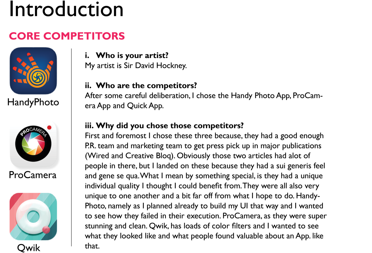
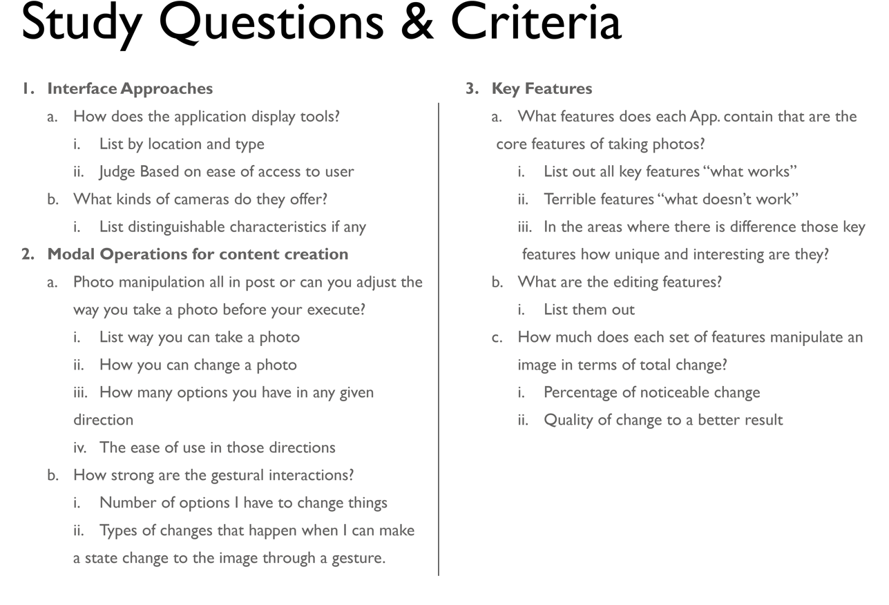
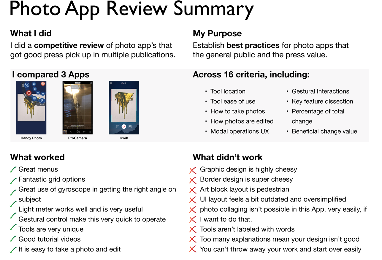
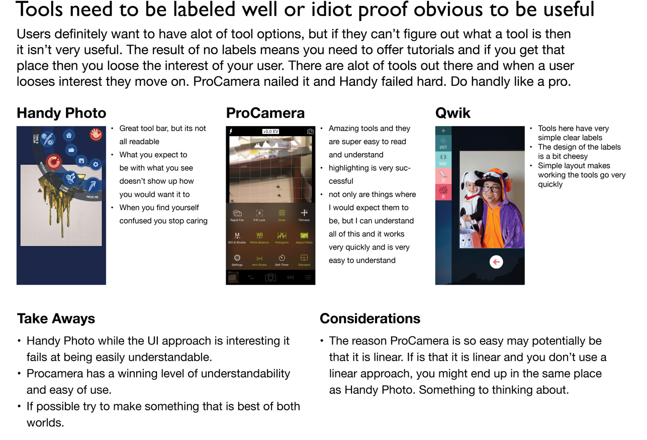
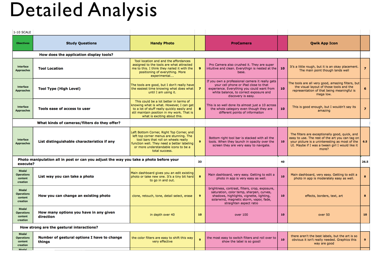
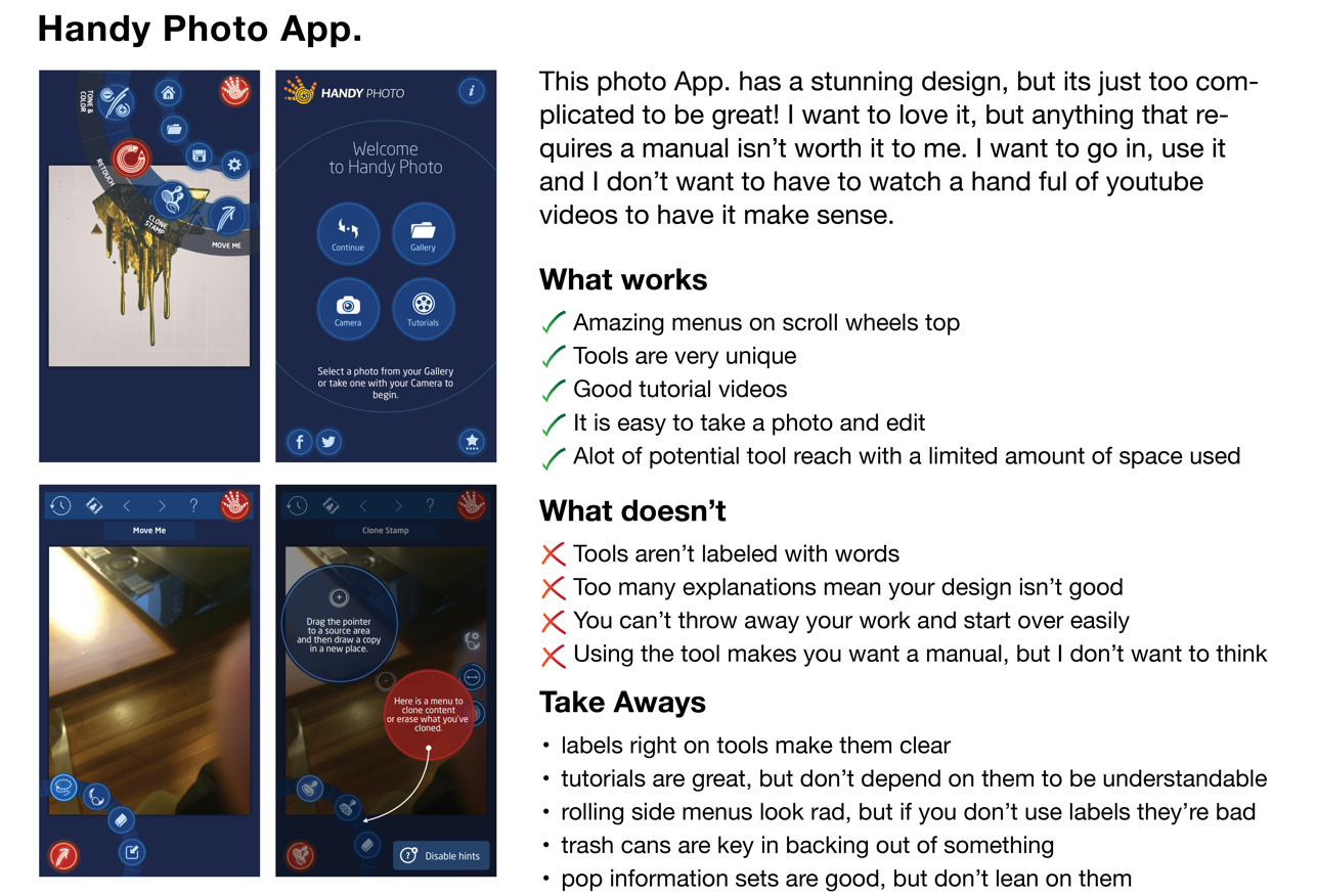
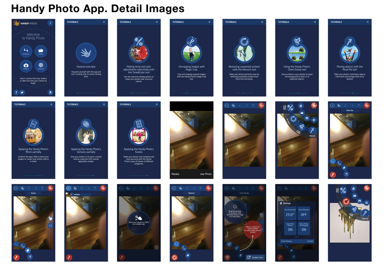
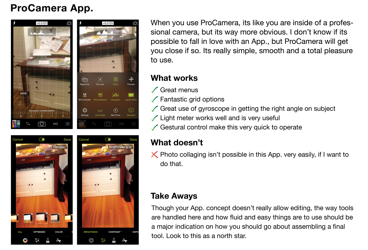
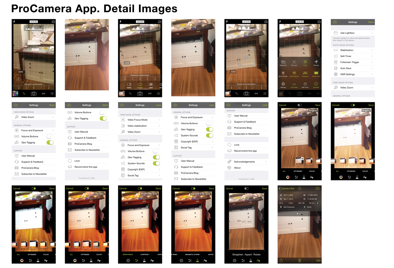
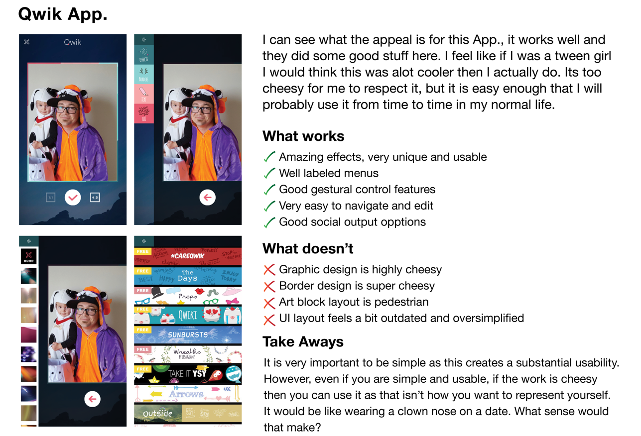
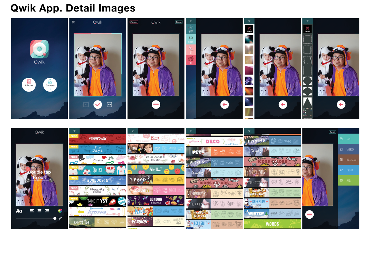
I explored Dan Brown’s book, Communicating Design, and his walk through of how to do a competitive analysis well. Using these ideas, and bringing some of my previous knowledge to the table, I explored what I considered to be some of the more compelling mobile photography applications. This exercise was particularly useful in sprinting concept development forward and discovering what didn’t work well in execution.
Slideshow (Hover to pause)
Objects of Image Creation

This project planned to leverage the internal mobile camera of the device the application was operating from. The look of the image was of particular importance to achieving a similar process, to how Hockney created his work. I spent a good amount of time in the studios of a close friends Carlo Dalla Chiesa and Jacopo Campaiola, who have a wide variety of images and cameras from all over the world. I worked with them to choose cameras and image result aesthetics that would produce physically immediate results so that the experience of taking images would feel authentic to a user.
Application Concept Model

Prior to any screen design, I generated a concept model to assemble all of the research surrounding the types of images we aimed to create, the machines we aimed to mimic, and the process of image assembly we intended to simulate. This map was a resource to refer back to along the entire design process in order to ensure that the design was in line with the research and early-stage decisions that had been made.
Information Architecture


